
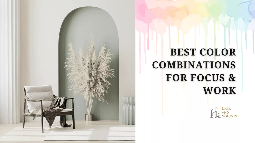
Some shades lower your mental volume, others wind you up for no reason. Color psychology isn’t some abstract theory; in fact, it shows how well you concentrate, how long you stay productive, and how balanced your feelings remain. If you’re planning to redo your home office, a study corner, or even rethink a bedroom setup, finding the best color for study starts with understanding how different shades affect your focus. You may also want to understand which colors support better concentration before making your final design decisions.
Brief Link Between Color, Mood, Focus, and Productivity
Picking a color, or let’s say a color combination, for a study room shows your taste. Walls don’t just sit there, they influence your mood. They keep nudging you as you open your laptop or crack open a book. You may even notice your focus drifting after some time.
When the colors hit right, something clicks within you. The chair feels better, you stop fighting the work, the mood settles, focus kicks back.
No matter what you are studying or working late at night, it feels like the punishment has stopped.
3 Colors That Improve Focus and Productivity
So, if concentration and productivity are your goals, here are three colors worth considering.
Blue
Blue is known for steadiness, calmness, slowing the pulse and easing that low-level tension. Sometimes its subconscious mind carries the tension you don’t realize.
As a result, you have a mental flow that feels smoother, less forced. You will feel change, ideas coming, increase in problem-solving and structured thinking. Using white versions of blue colors works better when you sit still.
Orange
Orange brings energy in the room, it sharpens attention and sparks creative thinking. Making you feel oddly motivated to keep things in order. If your surroundings are uncluttered, it helps you concentrate better.
Just be aware that too bright crosses the line from stimulating to distracting. Telling from my personal experience. Use a softer, balanced tone, think warmth and momentum, not visual shouting.
Green
Easier on the eyes and even easier for the mind. Green sits comfortably between yellow’s optimism and blue’s cool clarity. Borrowing a bit from both. That’s probably why it works almost anywhere in the house, though it really shines in study rooms, offices and bedrooms.
Color green gives a natural sense of calmness, also reminds us of trees, gardens, and actual breathing space.
More like this:

Mansi is a creative designer with three years of professional experience, specializing in clean, balanced, and purpose-driven visuals. She is also a passionate writer whose work shows a strong sense of layout, composition, and visual hierarchy. Outside work, she enjoys sketching, experimenting with color, and spending time around plants and outdoor spaces. Connect with her on LinkedIn.