
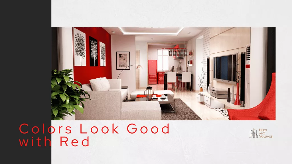
Red means power, red means warmth, red means confidence and dominance and what not. But when it’s about your home, if correctly used the red color then it brings energy into your space. This color also feels overwhelming if paired poorly or used without any intent. Asking “what colors go with red” is okay but also ask yourself “what works for how this space is used.”
Being practical is my take on this blog, no matter what your intent, I’ve noticed that the color red pairs well with far more than people expect.
1. Red and White
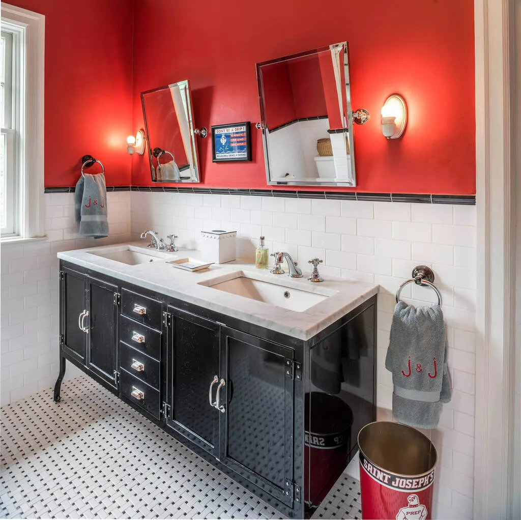
Need beach vibes in the bathroom? Try this combination with a touch of turquoise. Add large mirrors, bright red cabinetry, and chrome faucets with matching drawer handles. White goes perfectly with red because it softens red instantly, moreover white prevents red from feeling heavy and aggressive.
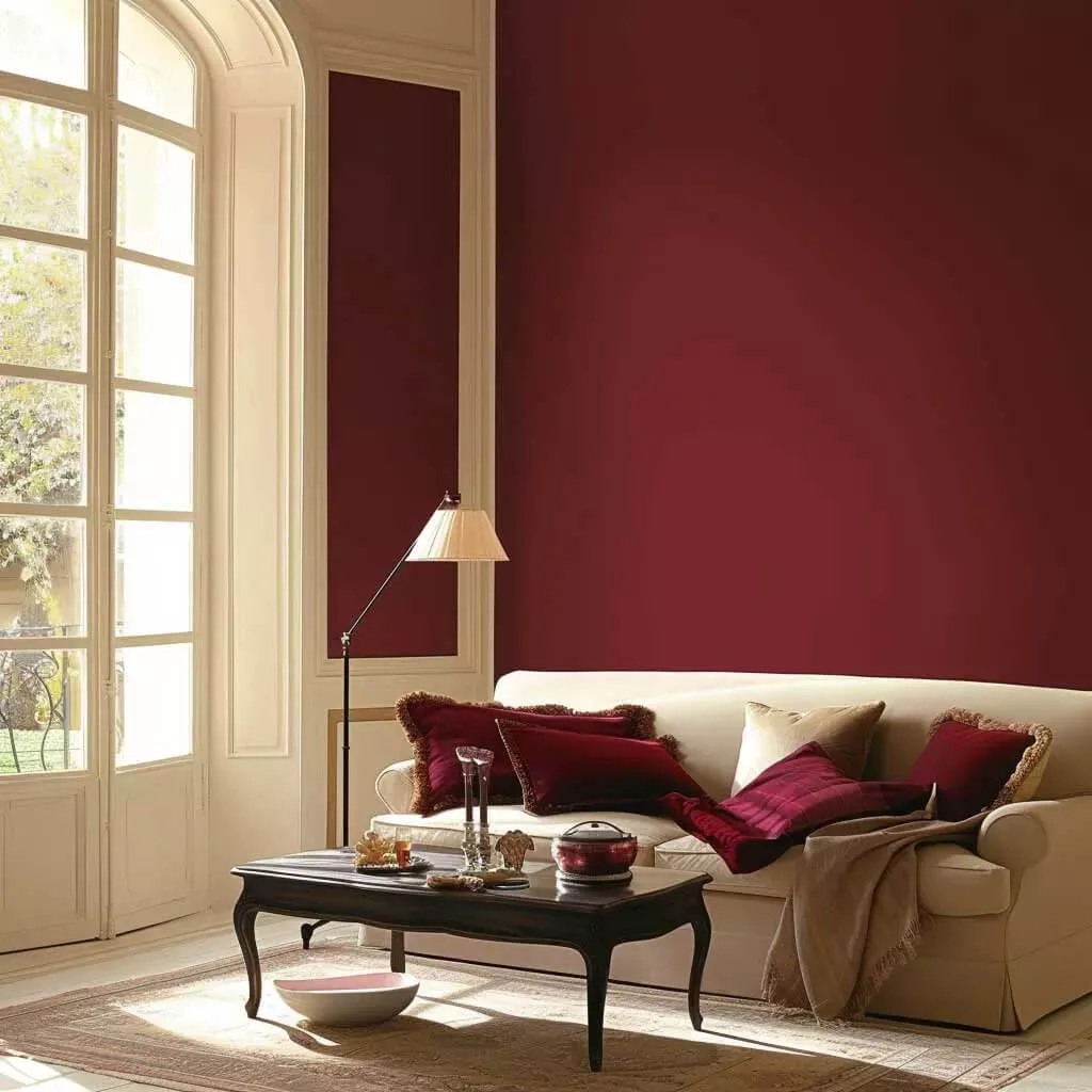
2. Red and Gray
Gray also has that tendency to control red’s intensity. Best suited for living room, home office, dining areas. Pair gray with deep red for drama. Add red through accents like cushions, rugs or feature a single wall. You may also add black or metal finishes for structure.
3. Red + Yellow + Lavender
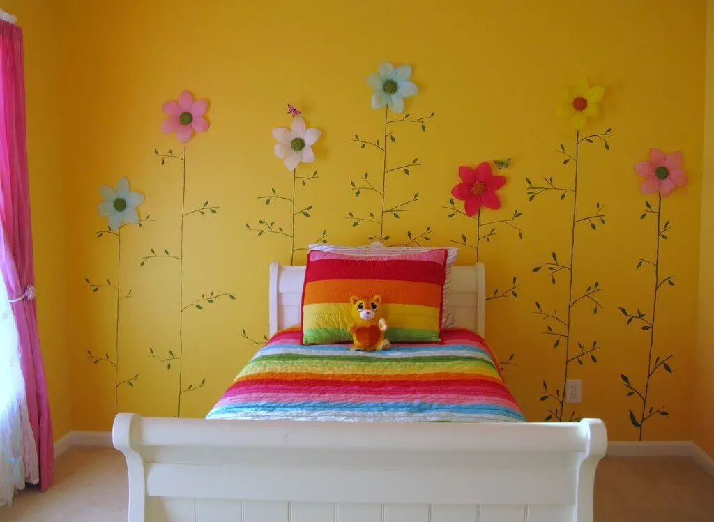
Try this energetic palette in kids’ rooms, creative studios, or even a small corner of a room. Have high ceilings, a chance to make a strong statement by using bold red-yellish patterns on curtains and rugs. Let one color dominate, usually yellow or lavender.
4. Rose + Gold + Maroon
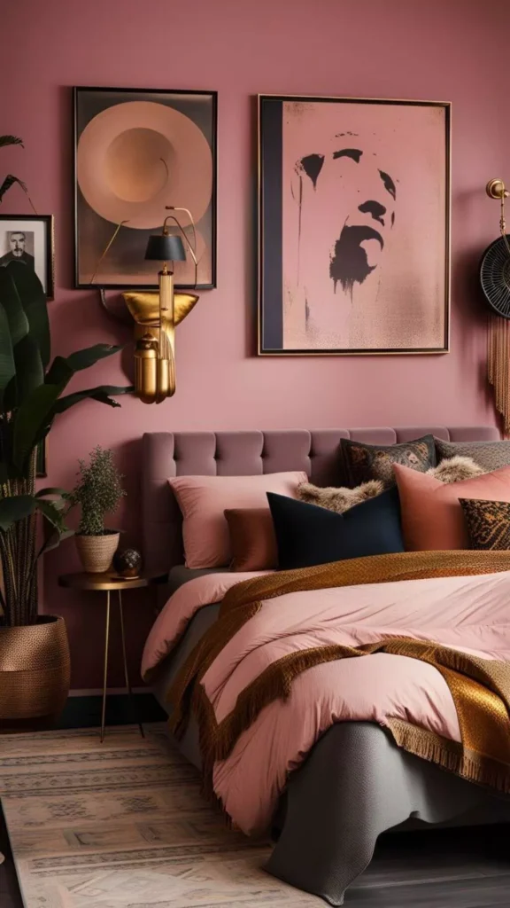
These colors add a sense of luxury, so use them in formal living rooms or bedrooms. This palette feels rich, elegant, and layered. Use rose on walls, maroon in upholstery, rugs and gold through lighting, mirrors, or trims. It’s better to stick to soft, matte finishes for a sophisticated interior.
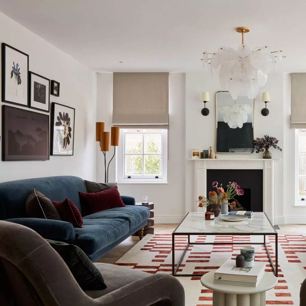
5. Red + Navy Blue
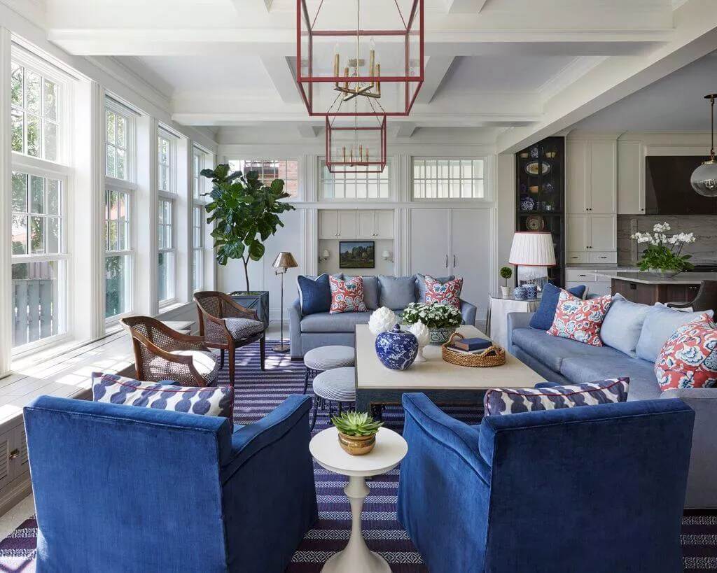
Timeless and classic pair, feels strong without being loud. You may choose navy as an anchor color, adding deep red through cushions, artwork, or accent walls. Use white or light beige to balance it out.
Related Read: Why Pink and Green Color Looks Perfect Combination
6. Red and Wood Tones
Talking about nature, want some classic, rich atmosphere, then go with light wood combined with softer shades of red. This combination works especially well in living rooms, bedrooms, and dining spaces where you want warmth, balance, and long-term comfort.
Keep visiting Lines And Volumes to find related ideas and practical guides to help you plan better.

Rahul works in digital advertising with a focus on performance-oriented campaigns and audience targeting. His experience spans campaign planning, execution, and optimization, with an emphasis on efficiency and clarity. Outside of work, he loves playing cricket and enjoys tending to plants and taking long drives. Connect with him on LinkedIn.